Luan JiangACCUROgo
2019-2020
ACCUROgo
Mobile EMR companion app for clinicians. Designed end-to-end from 0 to 1 using Material Design and Flutter, available on both App Store and Google Play.
Healthcare
EMR (Electronic Medical Record)
Mobile
B2B
Material Design System
Flutter
ACCUROgo
01 / 07
Project Overview

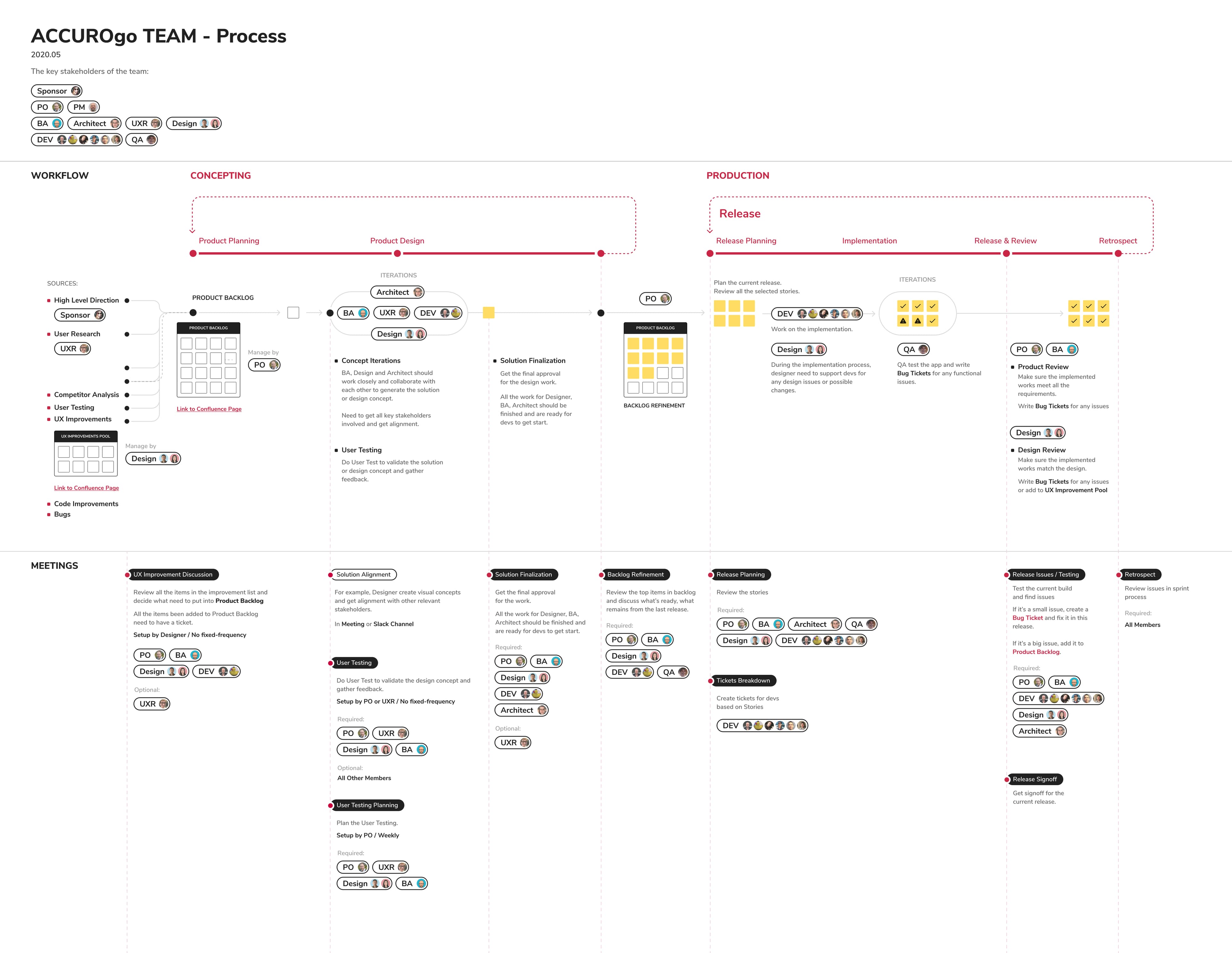
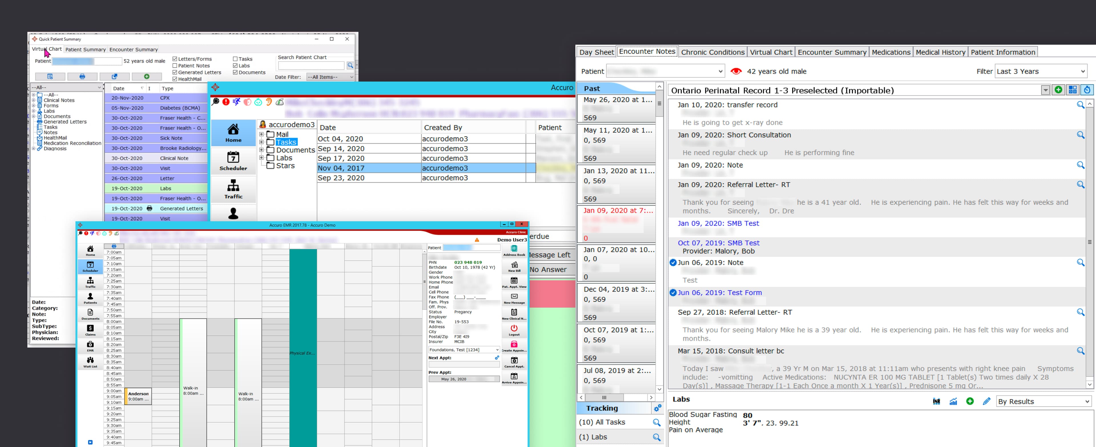
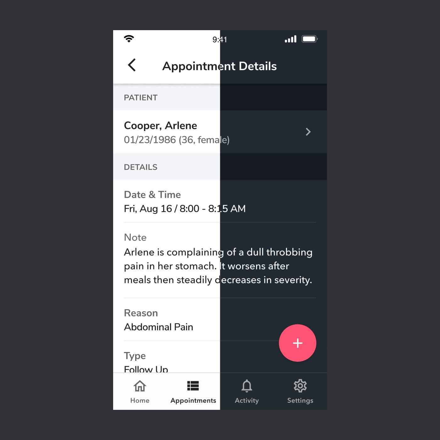
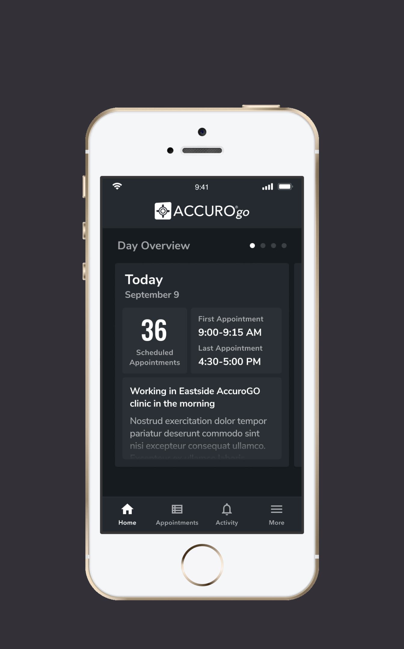
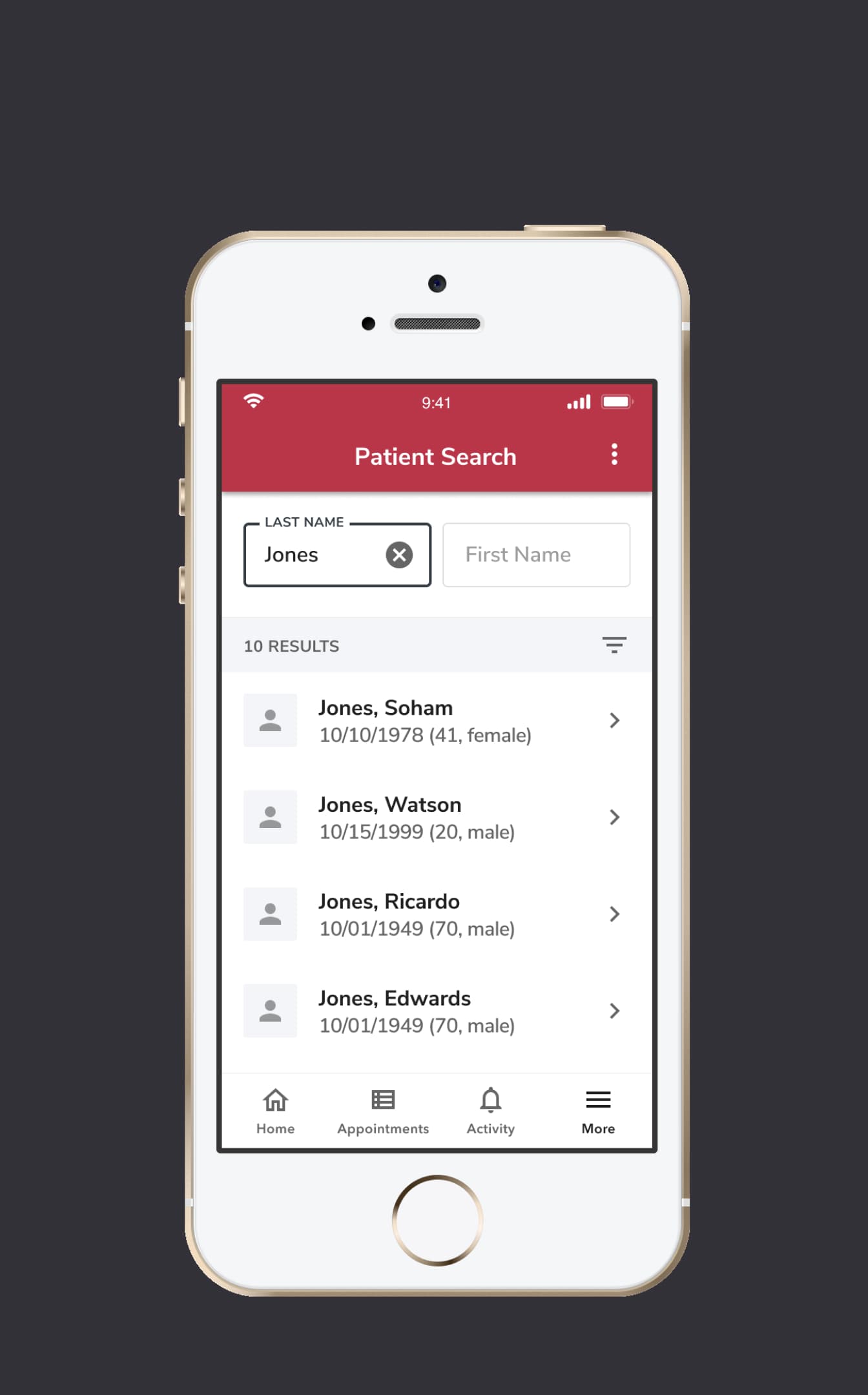
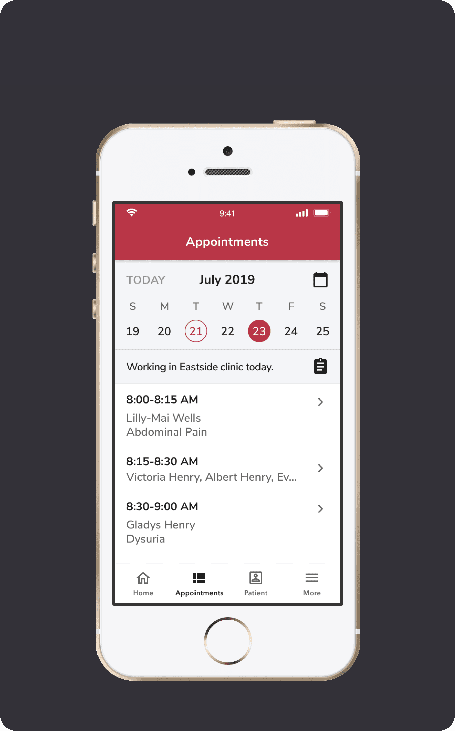
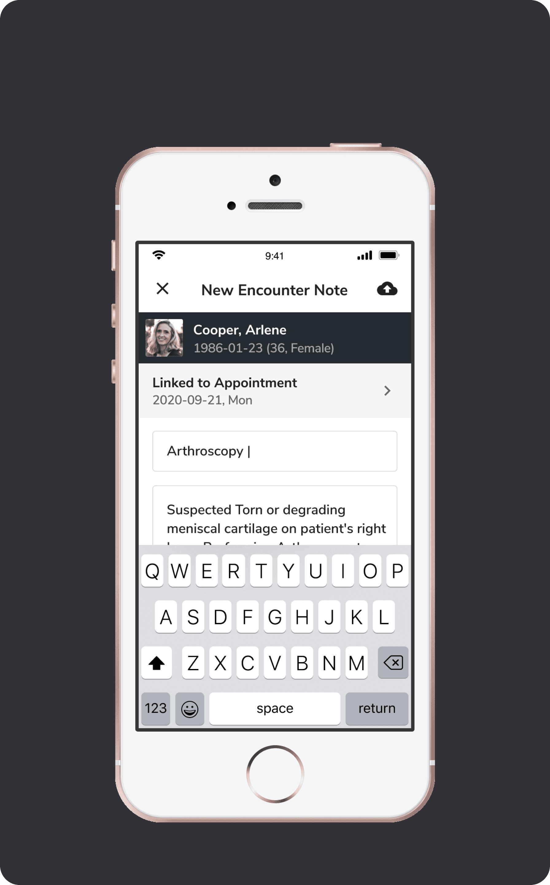
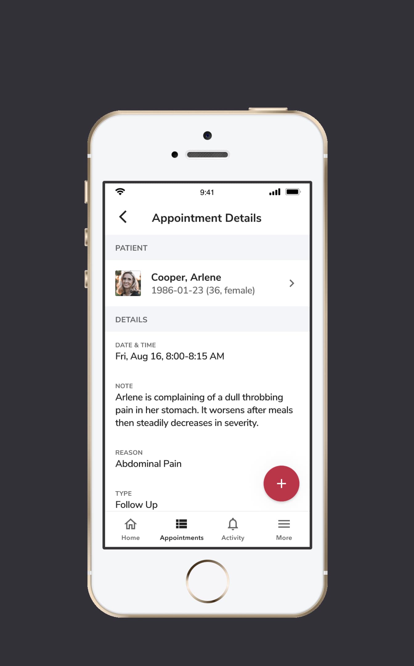
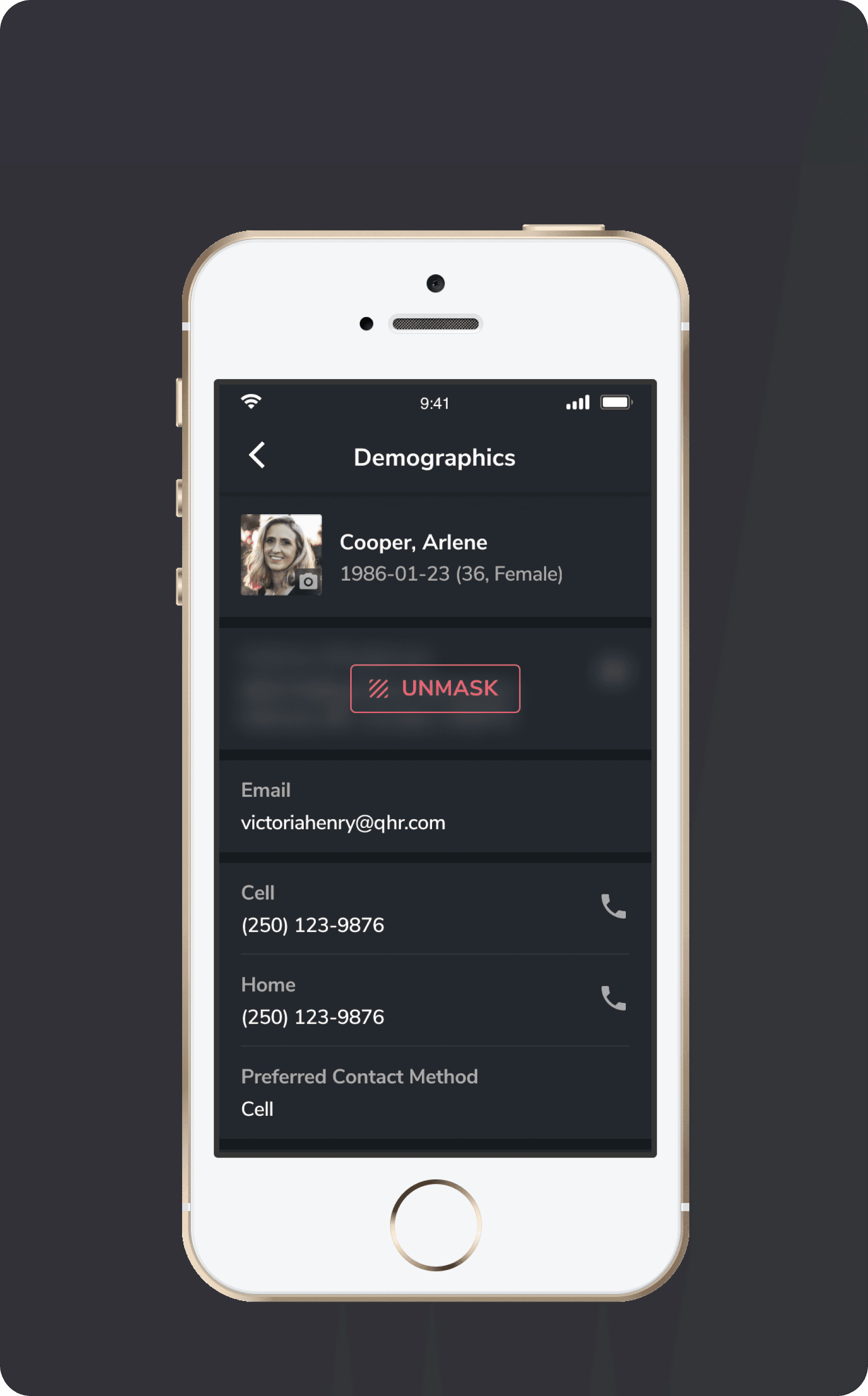
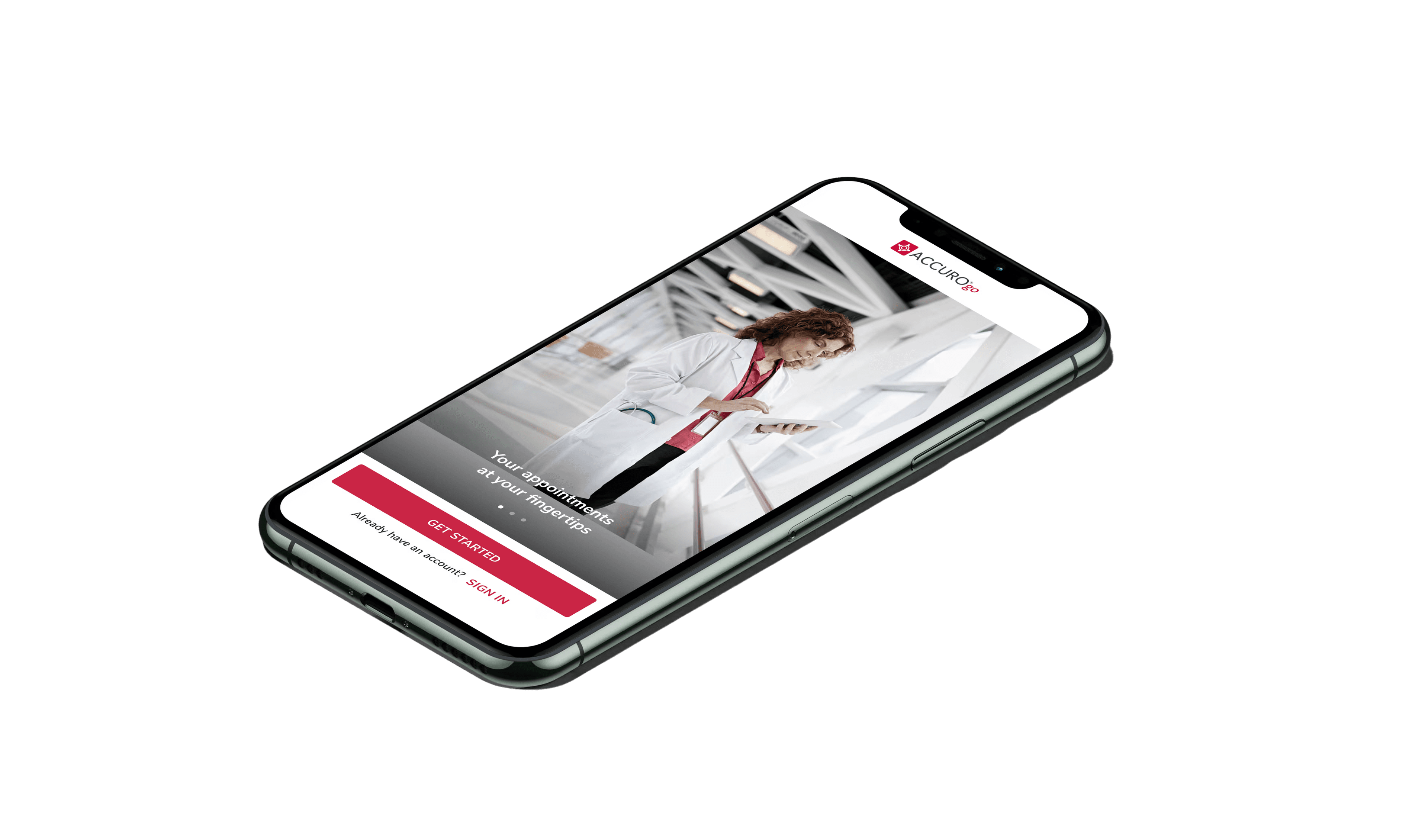
ACCUROgo is a companion app to the ASP-hosted AccuroEMR solution, enabling healthcare providers to access key EMR features from their smartphone or tablet, from anywhere with an internet connection.

I've facilitated the entire end-to-end process as the primary designer, evolving the product from 0 to 1.

A special thanks to Adam Coppock, who led the design during the project's early stages, as well as thanks to Lisa Kim, who also greatly contributed in the product's design.

The Problem

Electronic Medical Records (EMR) software is a collection of features and tools that allow healthcare providers to manage patients' digital medical records and automate clinical workflows. For a long time, desktop software has been the main scenario for clinicians. But as mobile devices get popular, there is a significant demand to expand the EMR experience to help healthcare providers access and manage the information for various scenarios and from different times and locations.

With Accuro as our desktop EMR solution, we hope to create a companion mobile app, ACCUROgo, to fill the needs of the mobile part and enhance the overall EMR experience for the healthcare providers.

02 / 07
Cross-Functional Team

The ACCUROgo project was the first time that we worked as a cross-functional team. So, it was quite a big change for every team member on their mindset and the new collaboration workflow. We adopt agile and sprint methodology. More importantly, we moved from the old school requirement first culture to a more user-driven culture.

As a designer, I had the opportunity to collaborate very closely with various roles, such as the Business Analyst, Product Manager, Product Owner, User Researcher, Technical Architect, Developers, QAs, etc. But we do have many challenges during the transition process.

In 2019, I had the pleasure of participating in the NN/g Nielsen Norman Group training for the specific topic of Working Effectively in Cross-Functional Teams
Gaps in Collaboration

During the early stages, we noticed gaps in how different roles communicated and handed off work. To address this, we created workflow charts that mapped out each team member's responsibilities and how tasks flowed between roles — helping everyone understand their part in the bigger picture.

Cross-functional team workflow chart
Product Design Process In Cross-Functional Team

We established an overarching design process that integrated seamlessly with the agile development workflow, ensuring design stayed ahead of development while remaining responsive to feedback and changing requirements.

What I Learned In Cross-Functional Team

Working in a cross-functional team taught me the importance of stepping back from the design area and understanding the broader product development context. It reinforced that great design doesn't happen in isolation — it emerges from strong collaboration, shared understanding, and mutual respect across disciplines.

03 / 07
UX - User Research

User Research is the starting point for the product UX design. We got the external resource to create solid user reports and an internal UXR team to create user persona and scenarios. Through all these efforts, the goal is to better understand our target users, their pain points, and the opportunities. Based on these, we started to come up with solutions and get all the essential features that we wanted to build.

User research report 01
User research report 02
User persona
User scenarios
04 / 07
UX - Concept Iteration
Take "Photo Capture & Editing" as an example
Core Insights & Direction

From user research, several core insights emerged that shaped our design direction: doctors are extremely busy with limited time between patients, privacy is a major concern in clinical settings, and the photo workflow needed to be streamlined for quick capture and documentation during consultations.

Design Research

Then I started to research different photo apps and looked at their flows and standard practices.

Design research - photo app analysis
Create Initial Concepts

Based on the research insights, I created initial user flows and wireframes to map out the core interactions and screen structures.

User flow diagram
Wireframe designs
Concept Iteration and User Test

I created high-fidelity concept designs and interactive prototypes to validate our assumptions through usability testing with real users.

High-fidelity concept UI 01
High-fidelity concept UI 02
Figma prototype for usability test 01
Figma prototype for usability test 02
* Rapid prototype created in Figma for usability test ran by the dedicated UX researcher in our team.
New Iteration

Working with Adam Coppock, we developed a new concept focused on rapid photo taking — streamlining the capture workflow to match the fast-paced clinical environment.

Old user flow
New user flow
* Rapid prototypes created in Origami for usability testing, each targeting a specific interaction hypothesis.
Prototype videos recorded by my colleague Adam Coppock.
Final Design

After multiple rounds of iteration and testing, I worked on the final product UI, incorporating dark mode support to accommodate clinical environments where screen brightness matters.

Final design - light mode
Final design - dark mode
05 / 07
Product UI Strategy
The Problem

We needed to create a consistent UI language across the mobile app while modernizing the look and feel to match contemporary design standards — all while staying connected to the existing AccuroEMR desktop experience.

Current AccuroEMR desktop software
* The current AccuroEMR (Desktop Software) [2021]
What I Did

I chose Material Design as the foundational design system and Flutter as the development framework, then created a comprehensive UI system tailored to healthcare needs — covering color contrast for accessibility, light and dark themes, typography, iconography, and reusable components.

Accuro brand guidelines
Material Design theme guides
* Accuro Brand Guidelines (Top) & Material Design Theme Guides (Bottom)
Color contrast accessibility checks
Light and dark theme comparison
Typography system
Color system
Icon system
Component library
06 / 07
Other Key Features At a Glance
Home screen - Dark mode
* Home (Dark)
Patient Search
* Patient Search
View Daysheet
* View Daysheet
Take Encounter Note
* Take Encounter Note
View Appointment Details
* View Appointment Details
Unmask
* Unmask
07 / 07
Marketing Video

Lastly, I also worked on the digital marketing for this product to concept, design and create the promotion video as well as some marketing visuals used in app store.

Watch the ACCUROgo Promo Video on YouTube

😊
Thank you for reading
I'd be happy to share more or answer any questions you may have.
View more work